Category: Uncategorized

Thermostats, Cruise Control and the Economy

The Federal Reserve has basically one tool for trying to control the nation’s economy – the prime interest rate. The board members meet on a regular basis and taking the current inflation data, as well as “broader macroeconomic data,” into account, they use their collective judgement to decide whether to raise or lower the prime rate.

Let me develop an analogy. Think of the prime rate as being the setting on your home’s furnace (slightly unrealistic, since most furnaces are binary – either off or on – but let’s suppose we’ve got a control that lets us turn on the heat a little, or a lot – we can set the furnace anywhere from 0 to 100%). The inflation rate would correspond to a thermometer in your living room. Broader macroeconomic data might be things like what’s the outside air temperature, is it sunny or cloudy, is it windy? The fed has a target inflation rate of 2% — we have a target home temperature of say 70o F. Of course, most homes come equipped with a simple device (a thermostat) that automates things, but for the moment, let’s pretend that we’re controlling the furnace manually.

You’re in the furnace room and the family yells down at you: “Hey it’s 68o in the LR!” You figure you want to heat things up, so you set the furnace to 25%. A little while later the fam reports “Yo! it’s still 68o.” “What’s it like outside?” you ask. “It just started snowing!” they reply. This is you developing “judgement” – you now know that moving the prime rate by 25 basis points isn’t enough in a scenario where there are strong economic headwinds. So you crank it up to 75% and a little later they complain that they’re broiling and they’re going to open a window. “Don’t you dare!” you riposte, while flipping the furnace to OFF and running upstairs to prevent the introduction of arctic air to the homestead. I’m sure you can imagine more comedic consequences — it’s clear that despite your eventual attainment of complete and total “furnace control wisdom” this process is going to lead to the house temp constantly cycling between too hot and too cold…

Maybe we should install a thermostat.

But wait! There’s more… There’s a beautiful area of Math known as Control Theory (to be fair, it’s a topic that’s sort of shared between Electrical Engineering and Math). Control theorists have studied the devil out of thermostats, and there is an inescapable “hysteresis effect” — a fancy way of saying that the temperature will inevitably cycle between a little too cool and a little too warm. For controlling one’s home temperature the effect is almost too small to notice, but if we wanted to automate the Federal reserve’s function the hysteresis effect would be undesireably large. This is mostly about lag. The temperature in one’s home can be measured more-or-less instantaneously; the data that goes into the Fed’s decision making is as fresh as they can make it, but at least a month or so old. Besides the hysteresis issue, putting a thermostat on the U.S. economy would be ill-advised for a variety or reasons: good human judgement can be used to adjust our control inputs to take many ancillary factors into account – there is also a psychological component concerning how market participants react to Fed pronouncements.

I would like to advocate for the Fed hiring a good EE who could help them to tune a PID controller for the prime rate. The rest of this essay will be about explaining what a PID controller is, and why they are so awesome. I don’t at all think that human judgement should be taken out of the picture, but having a Control Theory recommendation as a basis for deciding about rate changes would have a lot of advantages. To be honest, people don’t get onto the Federal Reserve Board without being pretty smart, so it’s entirely possible they’re already taking the stuff I’m talking about here into account – which would make me writing about control theory relatively pointless, but I’m halfway into writing this thing at the moment so I’m just gonna keep rolling.

So. What is a PID controller? First, let me say they’re fairly ubiquitous – but the example most people will be familiar with is the cruise control in a car. Second, let me mention that they’re amazing! A properly tuned PID controller makes it look like some ethereal, invisible hand is just grabbing your system, moving it to the set-point and holding it there against its will. PID stands for Proportional, Integral, Differential – the three factors that the controller uses to decide how to adjust the control input. Okay, I seem to already be using some jargon, so I’d better be more up front: A control variable is something whose value we are interested in, uhmm, controlling (like room temperature, vehicle speed, or inflation rate). A control input is something (like furnace setting, gas pedal depression, or prime lending rate) that effects that control. A control system will also have a set point – a value for the control variable that we want to maintain (like 70o, 65mph, or 2%). So, let’s go through the P, the I and the D pieces in successive paragraphs.

P stands for proportional. This means the control input is changed in a way that’s proportional to the deviation of the control variable from the set point. That’s probably intuitively obvious — if the current temperature is far below the set point we should turn the furnace up more than if it is close. Please notice that this is a very different thing from changing the set point. If it’s cold in your house, turning the thermostat up to 90o won’t make it get warm any faster than setting it at 72o. (Although, if your thermostat was a PID controller, maybe it would…) This part of the behavior of automotive cruise control is why if you hit “resume” when your car is stopped and the CC is set for highway speed, the acceleration is pretty decisive — as compared to what happens when you’re only a few mph below the set-point when you hit “resume”.

If you were driving on a long uphill section of road and the “gas” was applied only in a way that was proportional to how far your speed was below the desired speed, you’d end up cruising a few mph below what you asked for. This is where the I (integral) part of PID comes in. We give the control input a little extra kick when the control variable has been some distance away from the set point over a largish period of time.

Finally, on to D. Would you keep the gas pedal floored if you were going 63 mph and seeking to level out at 65mph? Probably not. In this final component of the PID trio, we look at the rate of change of the control variable. If your speedo reading is going up 1 mph every second, you should cut back on the control input (i.e., ease off the gas) so you don’t shoot right past the set-point and end up with a speeding ticket.

The red curve is the value of a control variable. At a given instant in time (now), the I and D are the area between the graph and the set-point and the slope of the tangent line, respectively.

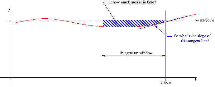
The last piece of the puzzle is this: how much should we weight the three components, P, I and D, in determining the control input? The physical nature of the system we’re controlling is going to influence these weights. For instance, a heavy car with a low-power engine will need to weight the I part more heavily than the D part. Conversely, a light, high-powered car can largely ignore the I part and concentrate on D. Figuring out the right weights to use to translate the P, I and D components into an actual setting for the control input is what I meant a few paragraphs back when I mentioned “tuning” a PID controller. This is really not Rocket Science, although, given how many PID controllers you’ll find on actual rockets, maybe it partly is Rocket Science…

There are a few other technical details – for instance, you have to decide on a time-frame to use in calculating the I part – but basically, you fiddle around with values for these 3 weights in a variety of scenarios until the control system responds the way you’d like it to. In a certain sense, translating experience with a control system into weight values for P, I and D is what is meant by the phrase “developing judgement.”

Understanding logarithmic plots

It’s mid-April, 2020, and we are in the midst of a global pandemic caused by a corona virus.  It’s not easy to find a silver lining in such a scenario, but for mathematically inclined folks it is nice to see people in the news media using the phrase “exponential growth” more or less correctly…

Prior to this crisis the usual usage was that “growing exponentially” just meant “growing a lot.”  But, the spread of a virulent disease is basically the poster child for exponential growth — and it is a phenomenon with such deep human meaning in terms of lives lost and suffering that we all seem to be becoming conversant with exponentials.  The, now famous, basic reproduction number of a disease points us to one of the ways that exponentials differ from more usual modes of growth — in exponential growth the quantity gets multiplied by something for each step forward in time.  Our human brains are much more used to things where something gets added for each time step.

That may be why exponential growth phenomena tend to surprise the hell out of us!  The growth happens in a strange and non-intuitive way…  It is very definitely the case that if exponential growth were better understood at the top levels of government, fewer Americans would be dying in this pandemic.  But this is the nature of exponentials, they hang out at small values (practically zero) for quite a while, until suddenly, they’re not zero, and just a bit later they’ve become astronomical!

Mathematicians have developed a trick for helping people to think about exponential phenomena.  The trick is to rescale the y axis so that moving upward a fixed amount corresponds to multiplying by something (not adding) — such plots are called logarithmic.  To be fair this is a pretty old trick (a form of logarithm was discovered by John Napier in 1617).

Here’s a plot of a typical exponential growth function:

exp1

It suffers from a problem that is typical for these sorts of growth patterns — it goes off the top of the chart!

Here’s the same growth function plotted using a logarithmic scale on the y axis:

exp_on_semilog

Such a plot can be very useful, especially when comparing growth patterns of widely disparate size (say the outbreak in the US versus the outbreak in Japan).  But you have to be very aware of the funky scaling that’s being used — moving up an inch on this graph means going to a y value that’s 10 times as big!  The labels on the y axis are written as powers of 10, the highest y coordinate on that graph is 1000.

Without a logarithmic scaling we’d need to use a very tall graph!  (Okay, not really, we’d scale the graph down so it fit on the page.)

exp3

But notice that this graph suffers from another shortcoming typical of plots of exponential functions: more than half of the plot is taken up showing values that are essentially zero (at least at this scaling) and then within a space of 2 or 3 units on the x axis, the y values shoot up and go off the top of the page again!

So, these logarithmic plots are very useful.  (Technically we’re talking about semilog plots — because only one of the axes has been rescaled logarithmically.)  But they can also be extremely misleading if you’re not aware of the funny business that’s being played with the y axis!

I’ve prepared a couple of animations to give you an intuitive sense of what this logarithmic scaling is all about.

In this first animation we’re looking at an ordinary plot of an exponential growth pattern and then we “reel in” all the y values between 1 and 10 so that they lie within the bottom inch or so of the plot.

seq1

In this next animation we’re doing the same thing for all the numbers between 10 and 100  — when we’re done the bottom inch of the graph has y coordinates between 1 and 10 and the inch above that has y coordinates between 10 and 100.


seq2
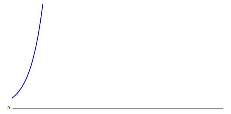
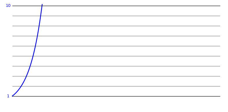
The next animation (if I had the energy to make it) would show us reeling in the y coordinates between 100 and 1000 so they’d wind up in the 3rd inch of the plot.  And so on…

Here’s an “all at once” view of the morph from a regular scaling to a logarithmic scaling for our function:

seq3

Armed with this understanding of semilog plots, you may find some of the graphs you see in the media more understandable.  A lot of interesting data is available at https://datausa.io/coronavirus and many of the plots can be switched between linear and logarithmic scalings.

The case for cutting taxes

Anyone who has a mortgage should know about a certain category of functions — piecewise exponential functions. The balance of your mortgage grows exponentially (albeit with a very small growth constant) and then you make a payment and the balance drops to some new level whereupon it begins growing exponentially again (until next month).  Question: what if your payment was only large enough to take care of the interest that accumulated in the previous month?  Answer: you are going to be paying that bill to the day you die…

This is the graph of the balance remaining (over the first few months) on a fictional mortgage of $100k at an interest rate of about 12%.  That’s an exorbitant interest rate by today’s standards but it serves better to illustrate the type of function we’re looking at: exponential growth over a period of time followed by a sharp reduction (that’s you making your monthly payment) followed by more growth followed by another payment, et cetera.

mortgage_bal

A company’s net worth is modeled by a similar class of functions.  As the owners and the employees toil away at whatever they’re doing, they are producing value.  The company’s net worth increases. This is a good thing – companies that are able to grow do good things for society; they create new products and services, they create jobs, maybe they give raises to their employees.

Then comes the quarterly tax payment…

tax-effect

The graph shows two scenarios for the growth of a company’s value.  In black, is growth with no taxation and in red we see the effect when a quarterly tax payment is added. (Both the rate of growth and the size of the tax burden have been exaggerated to help illustrate the issue.)

So-called “trickle down” economics has justifiably been derided as being “voodoo” — not based on facts, but rather on wishful thinking.  Reducing the tax burden on wealthy individuals is, most likely, only of benefit to those individuals.  This is human nature; people like to hold on to what is theirs, not let it trickle down to anyone else!

But, if we look at small business and corporate taxation through this lens the results are rather different.  Reducing taxation for businesses unleashes the power of exponential growth.  On the other hand, increasing taxation can actually lead to complete stagnation.  What matters to society is what a business does with the added valuta they can accrue if their tax bills are cut.  If all the money goes to shareholders and corporate officers then this wasn’t smart fiscal policy.  If most of the money goes to adding jobs and pay increases for the workers, then it was.

So here’s a modest proposal:  cut a business’s tax bill when their U.S. payroll (exclusive of executives and bonuses) has gone up.  That’s it.  If they add a plant in Tajikistan, that’s nice; the folks there can probably use the work — that just shouldn’t have anything to do with U.S. taxes.  If they want to give the CEO a 320 million dollar bonus, awesome!  I’m sure he or she did something that was equivalent to the full-time efforts of 10,000 average Americans.  But, I can’t see how a company that’s willing to sink such huge amounts into executive perks can claim to be overburdened by our taxes…

President Trump is making plans for an across-the-board corporate tax break.  It seems likely that most of the extra money generated by such a move will end up in the hands of relatively few Americans.  They will certainly trickle some of it down on the rest of us, but mainly they will just amass huge personal fortunes.  If, instead, the corporate tax cuts were tied to being good citizens (in exactly the sense that President Trump has lauded — the creation of jobs for Americans), I think the results would be better.

At this moment in time, the U.S. National debt has reached such a staggering level that it actually exceeds our annual GDP.  Imagine how you’d feel about your personal finances if you had nothing in the bank and you had credit card debt that totaled to more than you earn in a year!  This is really and truly not the time to be raising expenditures or cutting income.  Nevertheless, cutting taxes for the corporations that are doing the right thing by our society can help them to access the power of exponential growth.  That amounts to a lot more than a “trickle”!


the point of inflection

Recently I was teaching a class about exponential growth.  I gave a lot of the standard examples: bacteria, yeast cells in bread or wine, human populations. Then I gave some non-standard examples – the number of atoms that have undergone fission t picoseconds into the explosion of a nuclear device was memorable.  As I often do, I then commented that no real-world process can continue to undergo exponential growth forever…

The bacteria eventually consume their host – or their growth is limited by the host’s immune system. Either way, the exponential character of the growth comes to an end. The plutonium atoms get vaporized and separated (so that fission no longer occurs) before more than a fraction of them give up their little iota of energy as they split. The yeast cells run out of sugars to consume or drown in their own waste products, carbon dioxide and ethanol.

So, in the real-world, exponential growth always “runs out of steam.”  At first, the graph of such a quantity is both increasing and upward curving, but later, while the graph will continue to grow higher the curvature begins to trend downward.  This is known as logistic growth.

logistic_curve

The spot, right in the middle where the curvature changes from bending upward to bending downward is the point of inflection.  That name literally means that there is no curvature at that point.  (Imagine that red curve is a bird’s eye view of a road you are driving on.  At first your steering wheel would be slightly turned to the left; later it will be turned to the right.  At the point of inflection your steering wheel is actually pointed straight ahead – but only for an instant!)

Anyway, this one class, this one particular time, I also wondered aloud about whether we (the human population of the Earth) might be at the point of inflection?  Or perhaps we passed the inflection point within the last few decades?  This is certainly not an original thought, people have known for a long time about logistic growth, and certainly no one believes the Earth can hold infinitely many of us.  There must be a limit!  In descriptions of logistic growth they call it the carrying capacity.   There are many competing theories about what the Earth’s carrying capacity is and whether we have reached the inflection point or not.  Whether or not we’re there already, I’m convinced we’ll be moving into that downward curving portion of the logistic curve soon.

This is bad news.

One can refer to the carbon dioxide as “tiny bubbles” and the ethanol as “the water of life”, but the last few yeast cells in the fermenting wine just see it as choking to death in a vat that’s filled with their own waste.

Sorry.