It’s mid-April, 2020, and we are in the midst of a global pandemic caused by a corona virus. It’s not easy to find a silver lining in such a scenario, but for mathematically inclined folks it is nice to see people in the news media using the phrase “exponential growth” more or less correctly…
Prior to this crisis the usual usage was that “growing exponentially” just meant “growing a lot.” But, the spread of a virulent disease is basically the poster child for exponential growth — and it is a phenomenon with such deep human meaning in terms of lives lost and suffering that we all seem to be becoming conversant with exponentials. The, now famous, basic reproduction number of a disease points us to one of the ways that exponentials differ from more usual modes of growth — in exponential growth the quantity gets multiplied by something for each step forward in time. Our human brains are much more used to things where something gets added for each time step.
That may be why exponential growth phenomena tend to surprise the hell out of us! The growth happens in a strange and non-intuitive way… It is very definitely the case that if exponential growth were better understood at the top levels of government, fewer Americans would be dying in this pandemic. But this is the nature of exponentials, they hang out at small values (practically zero) for quite a while, until suddenly, they’re not zero, and just a bit later they’ve become astronomical!
Mathematicians have developed a trick for helping people to think about exponential phenomena. The trick is to rescale the y axis so that moving upward a fixed amount corresponds to multiplying by something (not adding) — such plots are called logarithmic. To be fair this is a pretty old trick (a form of logarithm was discovered by John Napier in 1617).
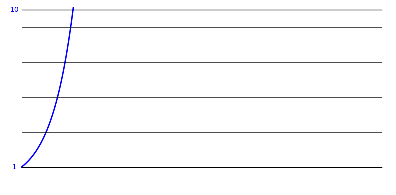
Here’s a plot of a typical exponential growth function:
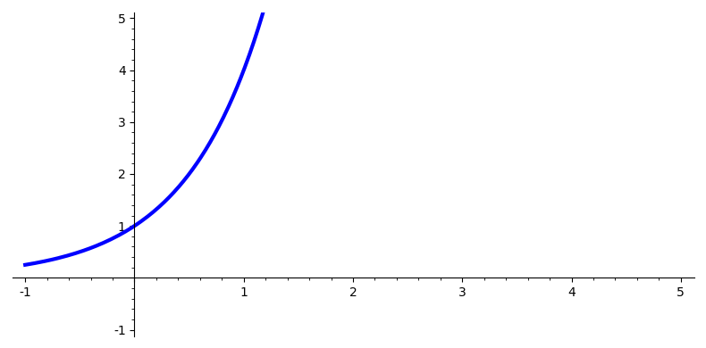
It suffers from a problem that is typical for these sorts of growth patterns — it goes off the top of the chart!
Here’s the same growth function plotted using a logarithmic scale on the y axis:
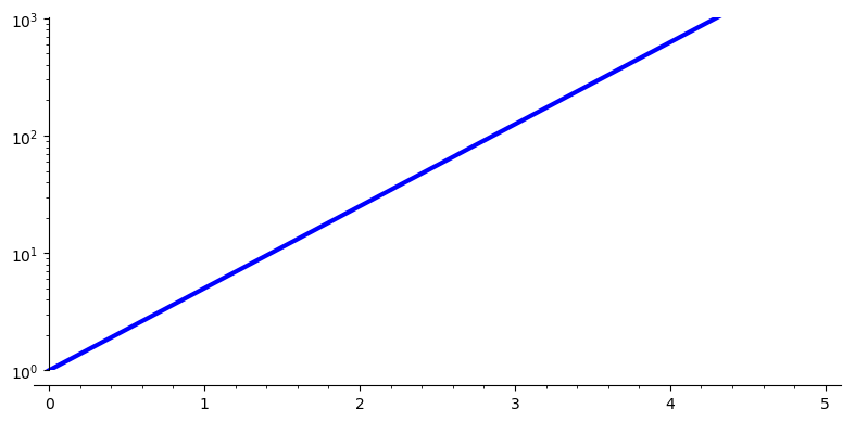
Such a plot can be very useful, especially when comparing growth patterns of widely disparate size (say the outbreak in the US versus the outbreak in Japan). But you have to be very aware of the funky scaling that’s being used — moving up an inch on this graph means going to a y value that’s 10 times as big! The labels on the y axis are written as powers of 10, the highest y coordinate on that graph is 1000.
Without a logarithmic scaling we’d need to use a very tall graph! (Okay, not really, we’d scale the graph down so it fit on the page.)
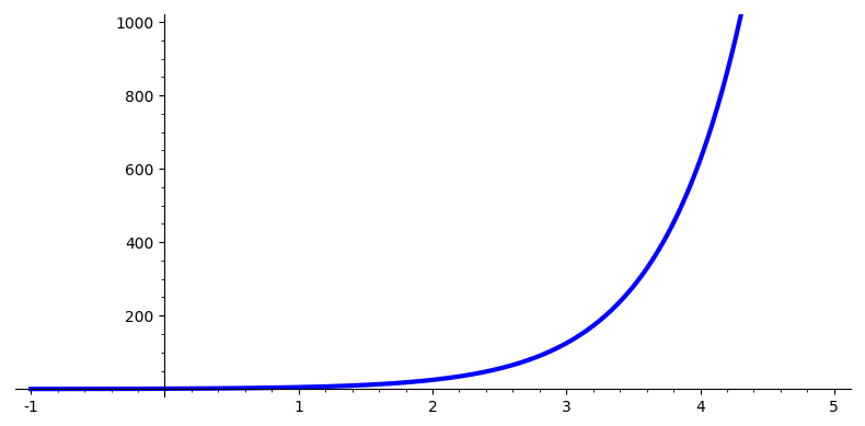
But notice that this graph suffers from another shortcoming typical of plots of exponential functions: more than half of the plot is taken up showing values that are essentially zero (at least at this scaling) and then within a space of 2 or 3 units on the x axis, the y values shoot up and go off the top of the page again!
So, these logarithmic plots are very useful. (Technically we’re talking about semilog plots — because only one of the axes has been rescaled logarithmically.) But they can also be extremely misleading if you’re not aware of the funny business that’s being played with the y axis!
I’ve prepared a couple of animations to give you an intuitive sense of what this logarithmic scaling is all about.
In this first animation we’re looking at an ordinary plot of an exponential growth pattern and then we “reel in” all the y values between 1 and 10 so that they lie within the bottom inch or so of the plot.
In this next animation we’re doing the same thing for all the numbers between 10 and 100 — when we’re done the bottom inch of the graph has y coordinates between 1 and 10 and the inch above that has y coordinates between 10 and 100.
 The next animation (if I had the energy to make it) would show us reeling in the y coordinates between 100 and 1000 so they’d wind up in the 3rd inch of the plot. And so on…
Here’s an “all at once” view of the morph from a regular scaling to a logarithmic scaling for our function:
Armed with this understanding of semilog plots, you may find some of the graphs you see in the media more understandable. A lot of interesting data is available at https://datausa.io/coronavirus and many of the plots can be switched between linear and logarithmic scalings.
